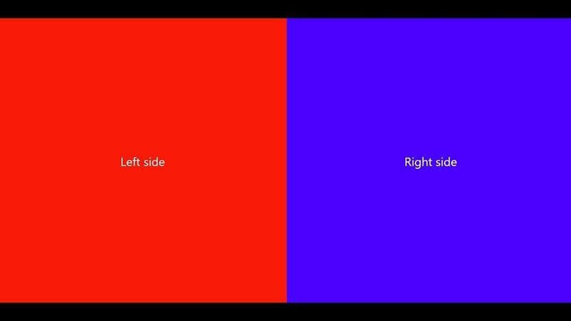
Dividing the design into two equal parts can be a wise decision for certain websites. Top web developers like this resource because it allows them to organize the elements that make up the design more quickly. Doing a project with this style can help you improve with the use of grids. You can also begin to understand other important concepts. In the design, such as symmetry, balance, contrast, and visual hierarchy.
Read Here – Best GIF Generator Websites
This style not only facilitates the work of designers but also improves visual reading and fluid navigation of the website. Not to mention that it is perfect for responsive frameworks so that it favors users of mobile devices. For all these reasons, dividing the screen into two parts is a resource. That is gradually becoming popular and is used more and more frequently.
In this article, we give you some guidelines and tips that you should keep in mind when creating a Web layout design with a split-screen.
Create a grid system
Including any Web layout design, it is essential to use a kind of grid to organize and align the elements. In certain websites, the use of the grid is evident, while in others, it is not so apparent. Despite this, if the design is pleasing to the eye, it is probably due to the use of a grid.
When using the split screen, you should understand the symmetry as it is a basis to create this type of design. You must use measurements accurately, so it can be a great way to learn to work with grids if you are not yet used to it.
Usually, the split design is used only in one section of the site, usually in the first screenshot, so you can add more variety to your site using a larger number of columns in other areas of the design. But the outline of the entire grid must start from the concept of symmetry.
Use bright colors and fonts
Both color and typography are key factors in any new design trends that arise. Probably because both elements are essential in any web design project. The great influence of flat design, minimalism, and other related trends places great emphasis on these two fundamental design components. Many top web developers use these design styles to create stunning websites for their clients.
This rule also applies to this trend: you can use vibrant colors and large, simple fonts on these two screens. Of course, this is not always the case, and you can add an image to each area of the design. But using vibrant colors, a powerful message, and a carefully selected font can also generate an impact on visitors.
Designate spaces for text blocks
Dividing the screen in two is an excellent strategy to work more easily with images or any type of content because it allows you to organize it more quickly. It also helps to create a point of attention or include call-to-action buttons. One of the main rules that should be applied is to make use of the spaces and choose a simple font. Equally important is the selection of colors because you must ensure that it is complemented with other elements such as photographs or images.
A split-screen should not necessarily be used when there are two possible options that the user can access. It can also be useful to create a clear partition between the main title and the image that helps reinforce that message. It can even be used in color with a certain degree of transparency so that part of the photograph that is colored is visible, and the text can also be read without difficulty.
Focus on the actions to take
The split-screen is mainly used to offer two main options to site visitors. It is usually accompanied by call-to-action buttons on each side, so colors are often used to generate contrast in each area so that they are much more differentiated. It is also used when the site welcomes various users, for example, platforms where employment is obtained. It is likely that one of them presents a split-screen on its landing page as it offers two main options: offering and seeking employment.
It is not the only way to use a split-screen, as we already mentioned. You can also use it to segment the image and text so that the user focuses on the call-to-action button.
In conclusion
Now Dividing the screen in two can be a useful resource in a variety of websites. Not only to offer two options to the user instead of one but to divide the type of audience. We want to reach and offer a more particular service for each group. It also helps us to more easily arrange the elements. That are part of the design, such as images and text.
We are sure that you can create a great split-screen Web layout design by remembering. The guidelines we have listed in this article. Remember all the knowledge you have regarding color theory. Visual hierarchy so you can create a pleasant visual design.
Author Bio:
Harnil Oza is CEO of Hyperlink InfoSystem, a mobile app development company in New York and India, having a team of the best app developers who deliver the best mobile solutions mainly on Android and iOS platforms. He regularly contributes his knowledge on leading blogging sites like top app development companies.